
UI Modes
We support three UI modes. modal or embedded or paymentLink.
If you want to embed the widget in your website, use embedded.
If you want to open the widget as a modal (in-app popup), use modal.
If you want to send the widget to someone as a payment link, use paymentLink.
Embedded
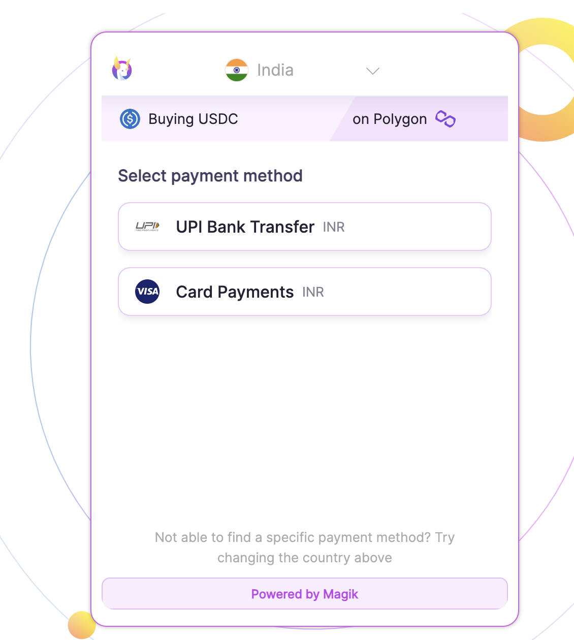
You can embed Magik's UI into your website or app like this.
We need a minimum width of 420px and minimum height of 580px. You need to ensure that the div you are embedding it inside is at least of this width and height.
Simply add our react component as a child of the component you want to render it in.
For iframe usage, add the iframe tag with the proper height and width in your layout.
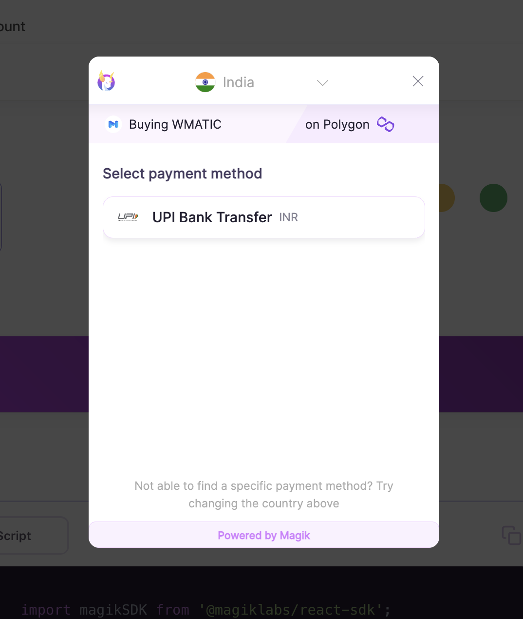
As a popup or modal
You can also use our SDK as a modal. In the modal option,
Payment Link
You can send the onramp.magiklabs.io url directly to your customers with the token and deposit Address.
See the Widget Setup on how to generate the url for sending to your customers. Here's an example payment URL.
Appearance Customisation
You can add your own colors and logo to the widget.
The primary color can be passed in the parameters as the primaryColor parameter in hex value #eeeeee.
Once you send us the logo, we will add it on our end and it will be linked to your API_KEY.
We currently support light theme. We will support dark theme at a later date. If you want support for dark theme for you website or app, reach out to us at [email protected]